Case Study 03
Village of Archbold,
Ohio
Government website redesign for a small northwest Ohio village — transforming a cluttered, overlapping layout into a clean, confident design built around their navy and gold brand, a grid calendar their residents actually asked for, and navigation that doesn't require a map to use.
Overview
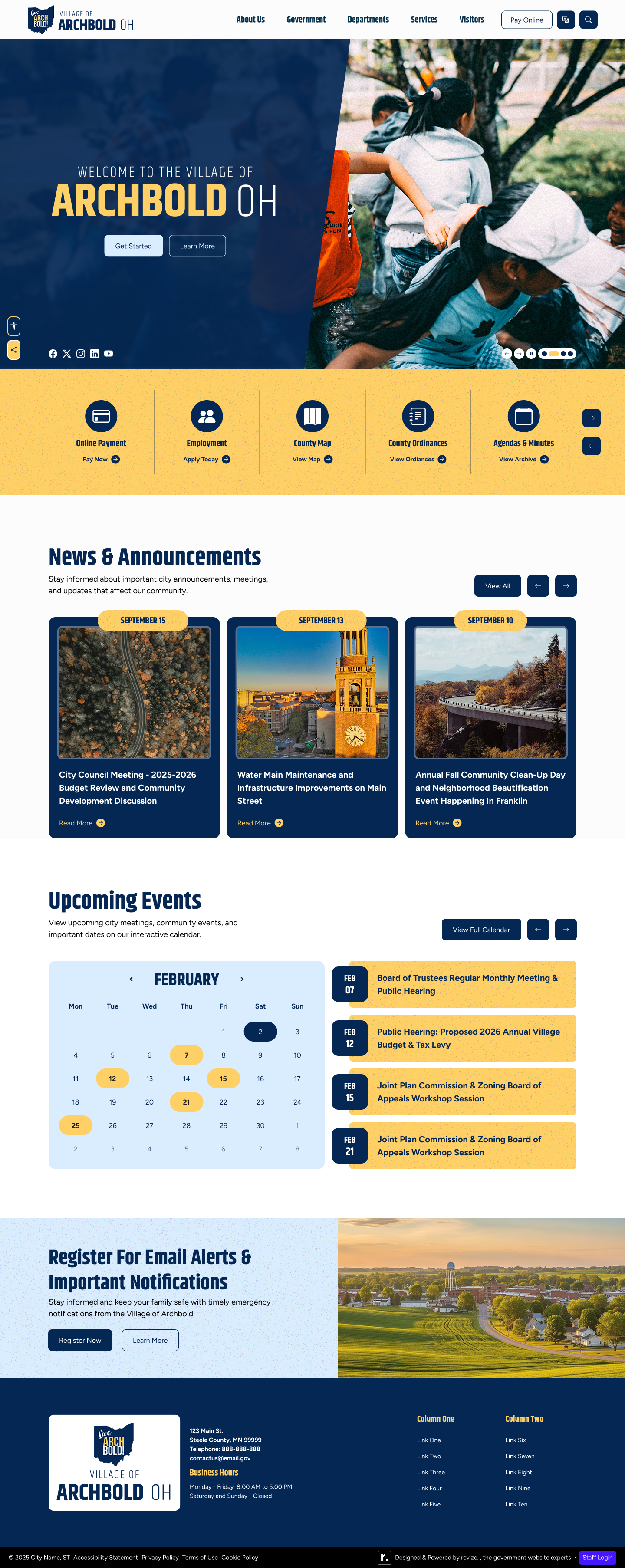
A village that knew exactly what it wanted
The Village of Archbold, Ohio came into the kickoff meeting with clear references, specific complaints about their existing site, and a list of concrete requirements. That kind of client engagement is a gift — it means the design brief is real, the feedback will be useful, and the path to approval is clearly marked.
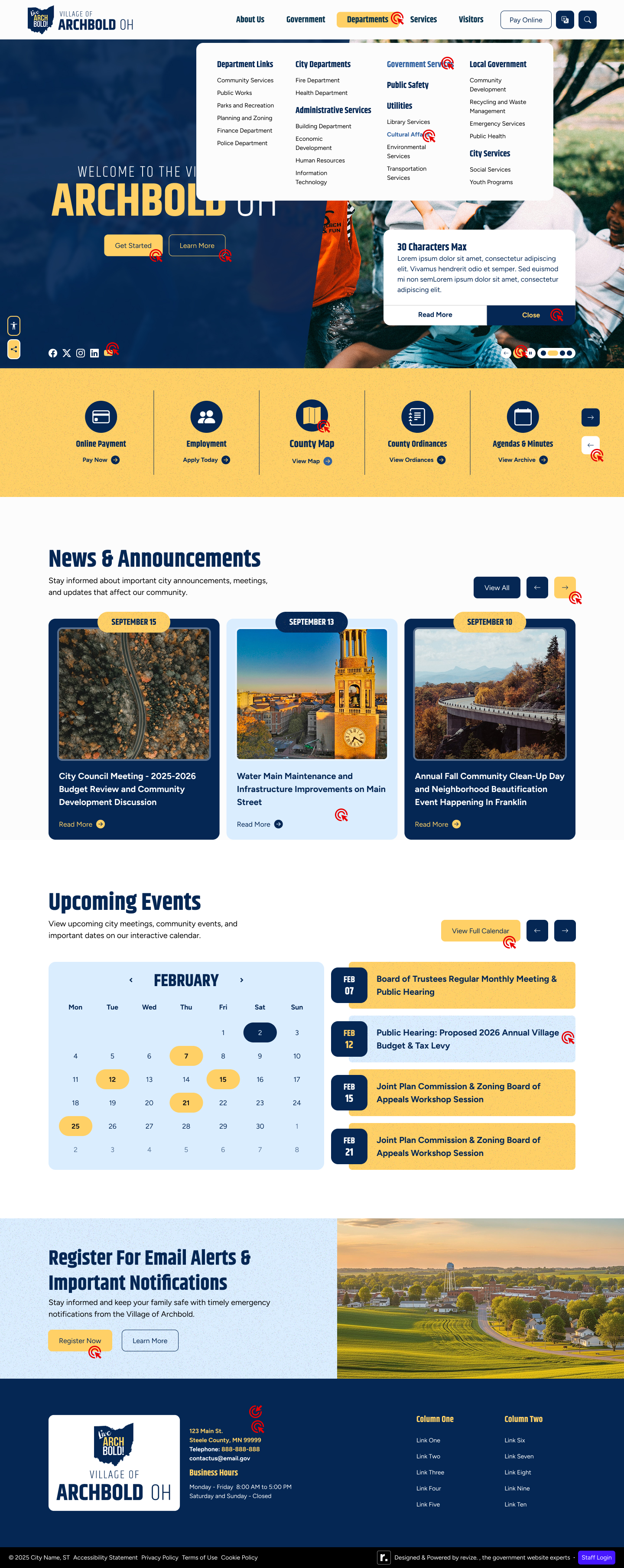
The core problem was visual complexity: overlapping elements, a busy hero, and a navigation structure that had grown unwieldy over time. The redesign brief was essentially the inverse — simple, clean, easy to navigate. Their reference point was the City of Troy: clean hero, simple navigation bar, professional and easy to look at. That framing held for every decision from the first concept through Revision 2.
Process
From cluttered to clean in two revisions
Design Decisions
Navy, gold, and a calendar that actually works
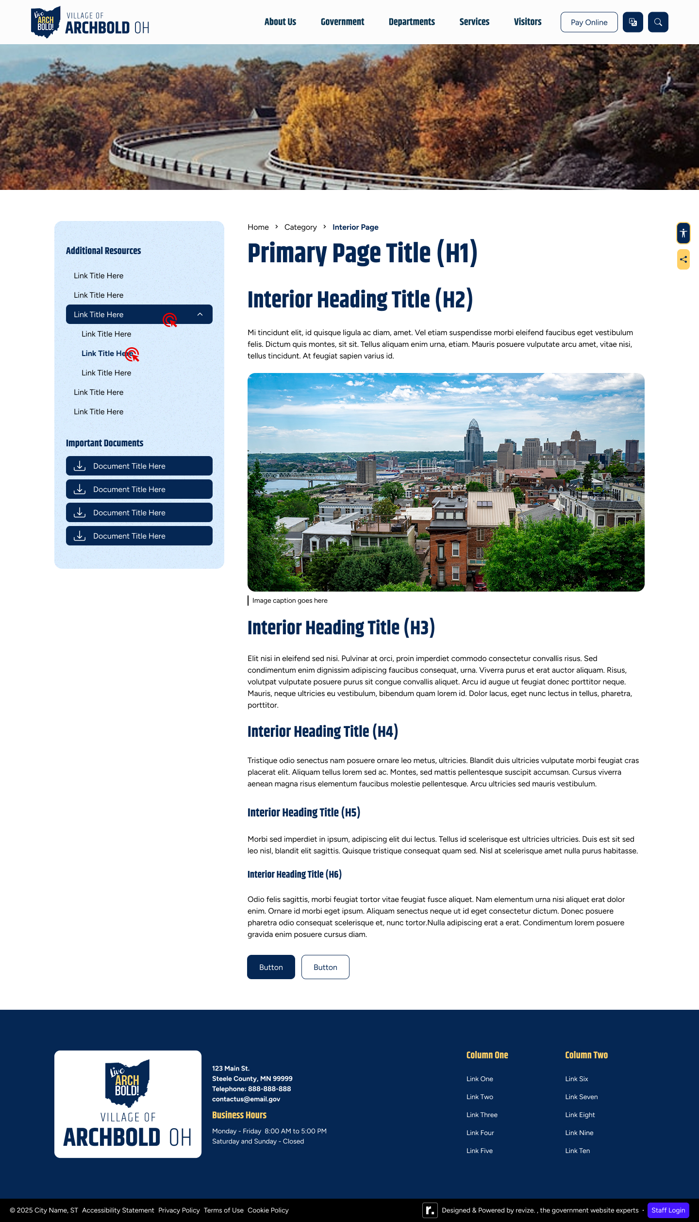
The visual language was already defined by the logo — navy blue and gold, with lighter blue as a secondary accent. The design system job was implementing those colors in a way that felt modern and clean rather than the dated treatment on their existing site. Every decision worked toward the same goal: reduce visual noise without reducing utility.
Design Screens / Revision 2 (Final) / Desktop 1440px
Accessibility
Brand colors that pass
Navy and gold are classic government brand colors — but they don't automatically meet ADA contrast requirements at every size and weight. Each combination was verified before the first design was shown to the client. Accessibility compliance was treated as a baseline condition, not a final check.
Color contrast
Navy backgrounds with white text verified at 4.5:1+. Gold used for icon backgrounds and accents — verified against the navy card backgrounds it's paired with throughout the quick links section.
ADA module
Sticky accessibility widget added — the client's existing site had none. Floating button style, positioned to remain accessible without conflicting with emergency alerts or navigation on mobile.
Calendar accessibility
Grid calendar designed with visible date labels, clear event indicators, and sufficient contrast for users with visual impairments. No color-only event coding — labels carry the semantic meaning.
News without image text
News cards use headline and excerpt text — no text embedded in images. This was already aligned with the dateless news approach: content that reads correctly in screen readers and doesn't rely on image alt-text to convey meaning.
Outcome
Simple, approved, delivered
The Village of Archbold approved the design at Revision 2. A small village with a clear brief, specific references, and the self-awareness to articulate what wasn't working about their current site — that combination makes for a smooth, high-quality project. The result is a site that looks like what they described at the kickoff: clean, professional, and easy to use.