Case Study 06
City of Franklin,
Indiana
A full rebrand for a historic Indiana city — new logo, new color system, new type pairing, new website. Most municipal projects design around an existing brand. Franklin let us redefine it.
Overview
An unusual scope: redefine, don't redress
Franklin is a small historic city south of Indianapolis — Romanesque Revival courthouse, restored Victorian brick downtown, an Artcraft Theatre marquee that's been lighting up Main Street since 1922, and a recently built downtown amphitheater that anchors a year-round festival calendar. Strong visual DNA, weak visual identity.
The brief was unusual for Revize: client wanted a new logo, a new palette, new typography, and a new website — all of it. Most municipal redesigns inherit a logo and brand they have to design around. Franklin invited a full rebrand. That changes the design problem from “modernize what exists” to “decide what this city should look like next.”
Discovery
Three directions, one decision
For the kickoff I built three concrete brand directions instead of asking the client to describe what they wanted in the abstract. Each direction came with a palette, a reference project, and a one-line philosophy — Heritage Evolved (modernize the seal), Confident Civic (step away from heritage entirely), Distinctive & Warm (lean into the brick downtown and Artcraft Americana).
Client's answer was Direction A — but pushed further than I had drawn it. They wanted to keep the modernized civic feel, drop the gold entirely, and lean cooler: blue + teal as primary, with meadow/lime green and warmth as accents. The clock tower (which I had assumed would anchor the logo) was rejected — they felt it represented the county seat, not Franklin specifically. The amphitheater emerged as the strongest icon candidate.
Logo
A wordmark first, an arch above, a date below
The final mark is a custom geometric sans-serif wordmark, “Franklin,” with an abstract arch element above and the founding date “1823” small below. Stacked and horizontal lockups; full color and B&W variants of each.
The arch is deliberately abstract. Insiders see the amphitheater. Outsiders see a graceful curve. That ambiguity is a feature, not a compromise — it scales for embroidery, prints in a single color, and stays meaningful even when the literal reference fades from public memory. The wordmark, not the icon, leads the identity.
Brand Guidelines / Logo, Palette, Typography
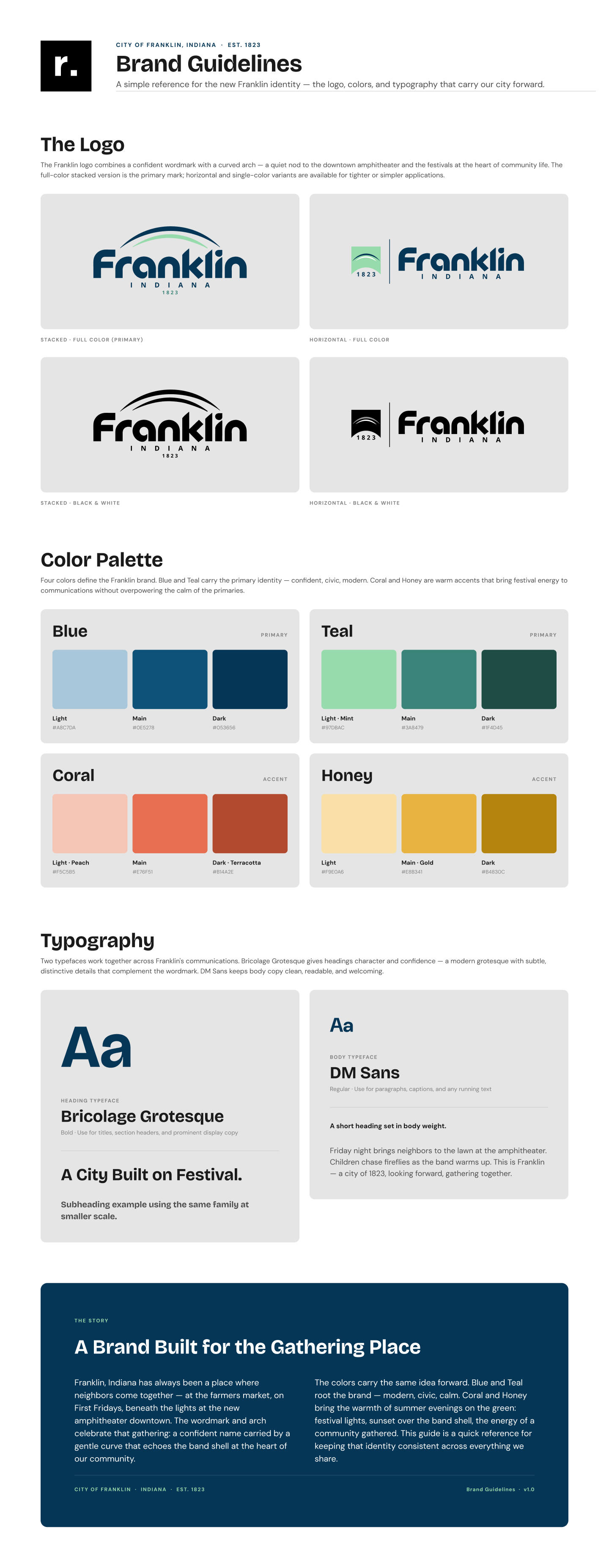
Color System
Two cool primaries, two warm accents
The locked palette is four families — not three, not five. Each runs Light / Main / Dark, giving the system enough range for a full website without sprawl. Blue and Teal carry the primary civic identity; Coral and Honey provide the warmth a small festival-driven city needs.
Coral is Teal's complement on the color wheel. Honey isn't arbitrary — it matches the actual wood color of the amphitheater the brand is built around. The system has reasons for itself, not just preferences.
Typography
Bricolage Grotesque + DM Sans
Heading: Bricolage Grotesque — modern grotesque with subtle distinctive character. Body: DM Sans — clean, civic-warm, highly readable. Both are Google Fonts, so the system stays accessible to the city's in-house team without licensing friction. The pairing was tested across hierarchy levels for two-track readability — display weight for festival event titles, regular for code-of-ordinances density.
System Build
Variables, modes, and a guide that updates itself
The brand was built as a Figma design system from day one. Color variables grouped by family (Color/Brand/blue-*, teal-*, coral-*, honey-*); font-family variables for heading/body; text styles bound to those font variables. The client-facing Brand Guidelines page is wired into the same system — when a token changes, the guide updates with it. That's the difference between a brand presentation and a brand system: one is a deliverable, the other keeps working.
Variables
Color and font-family variables tied to design system. Renamed mid-project from generic primary/secondary to family names blue/teal/coral/honey for clarity.
Text styles
Heading and body text styles re-bound to local font variables — three legacy library bindings (Inter via shared lib) caught and corrected during the build.
Brand Guidelines page
Client-facing four-section guide (Logo, Color, Typography, About). All values bound to design system tokens — guide stays accurate without manual updates.
Lockup exports
Master .ai source plus four SVG exports — Stacked / Horizontal × Full Color / B&W. Ready for embroidery, signage, vehicle, and digital use.
Status
Branding locked. Site in development.
The brand identity — logo, palette, typography, and design system — is locked. The website track is in active design, building on the same system. Calendar-before-news (Franklin is event-driven), large hero with featured background video, glass-blur quick links, footer with a phone-directory button instead of a single number, sticky horizontal nav with utility bar above. Target launch: end of 2026.