Case Study 06
City of Temple,
Texas
Large city website redesign across three sub-sites — five revision cycles, mobile-first design exports, and coordinated design for City Hall, the Public Library, and Parks & Recreation. A masterclass in client iteration.
Overview
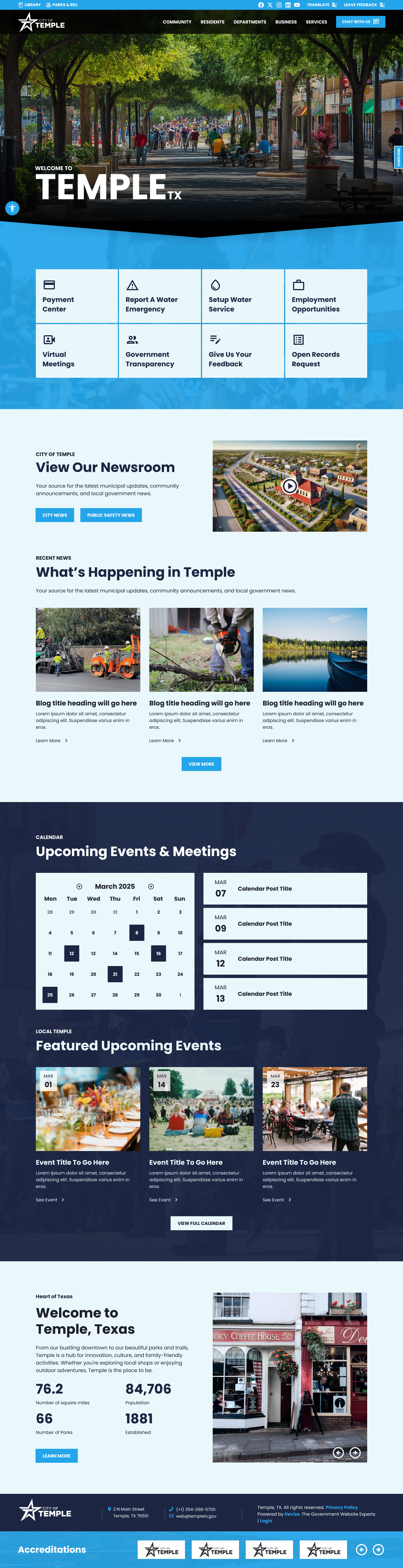
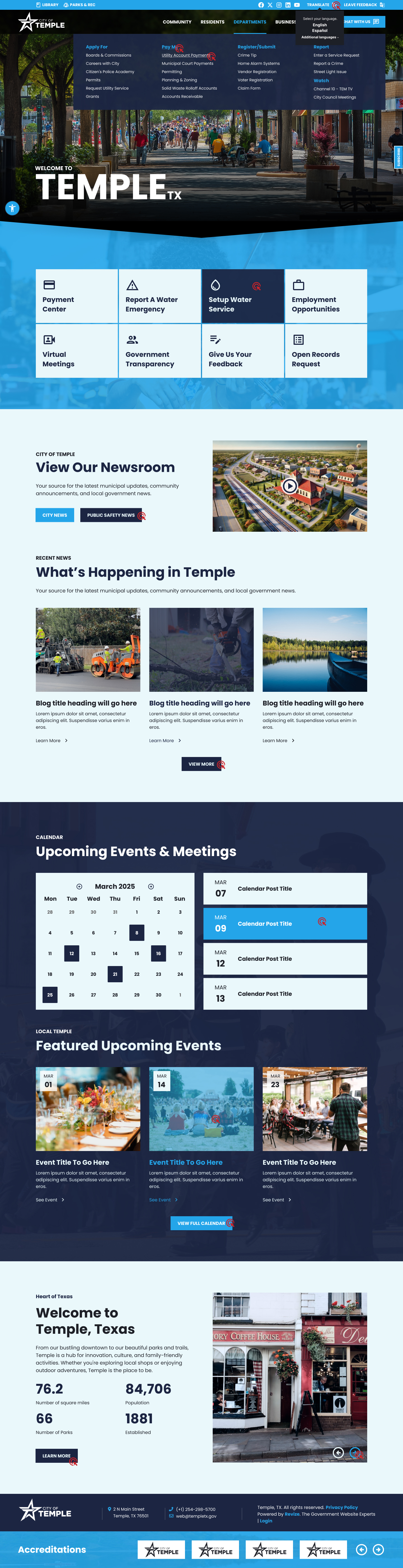
A large city with complex needs
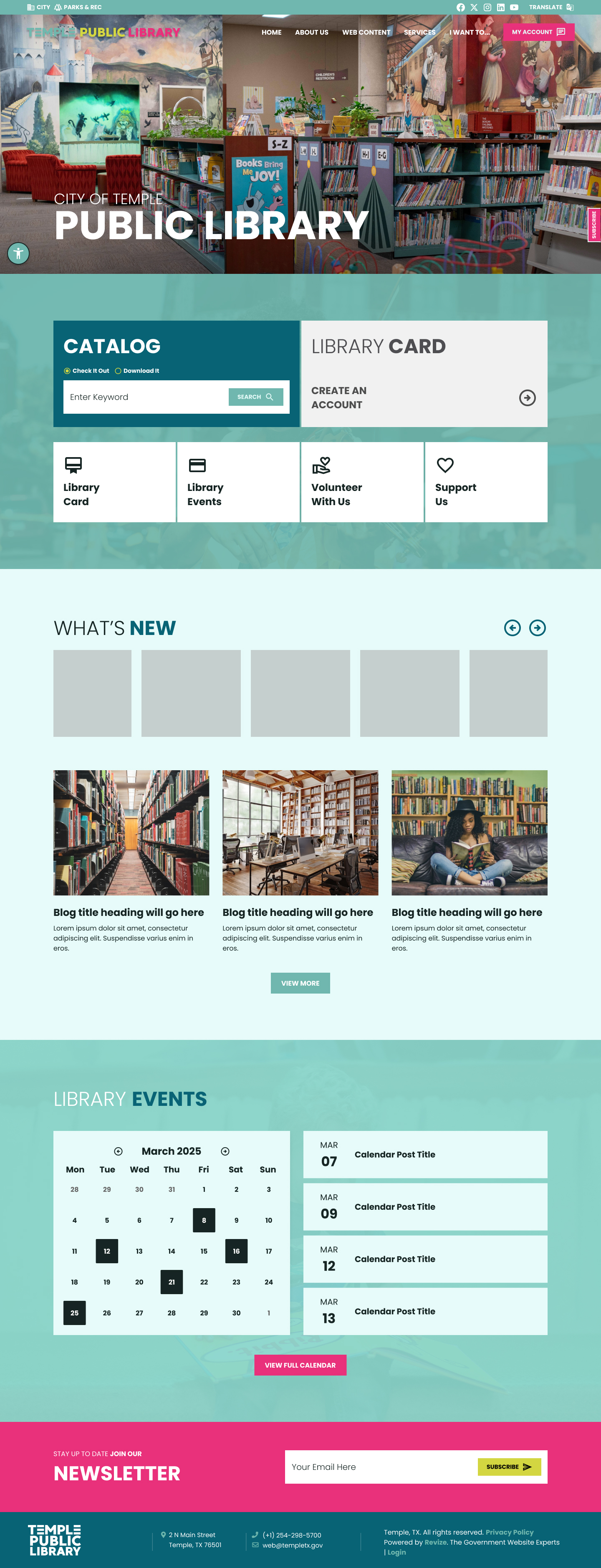
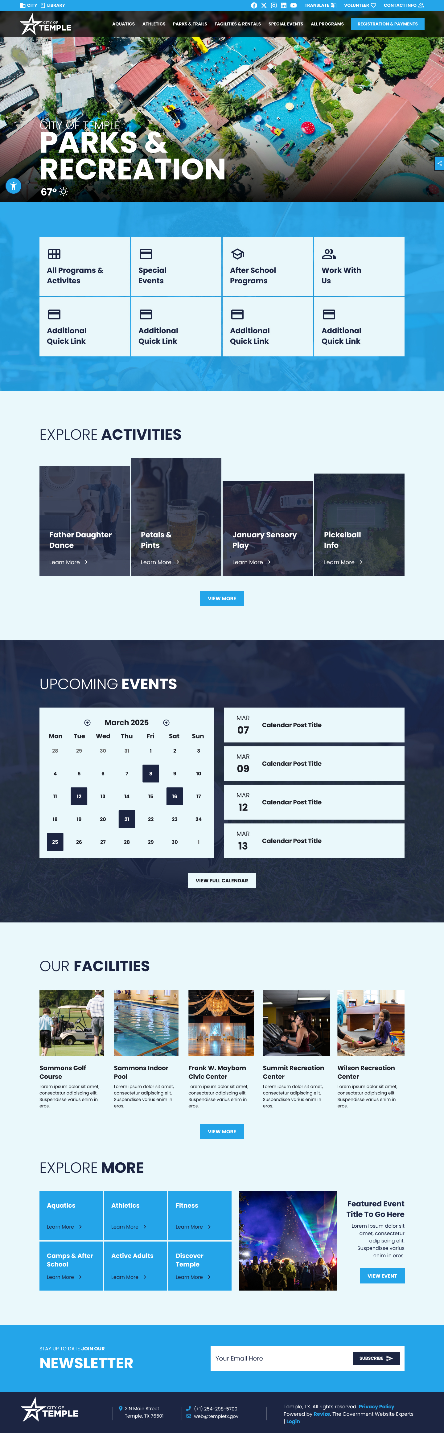
Temple, Texas is a mid-size city with a full range of municipal services, a dedicated public library system, and an active parks and recreation department — each requiring its own coordinated web presence. The redesign scope covered all three: a primary city site, a library sub-site, and a Parks & Rec sub-site, all designed to function as a unified digital experience while maintaining distinct departmental identity.
Temple also required mobile-first design artifacts — full mobile exports at 375px alongside the standard 1440px desktop views. Mobile wasn't treated as an afterthought or a development-phase concern. It was part of the design deliverables from day one.
Challenge
Five revision cycles. Still standing.
Most government website projects complete in 2–4 revision cycles. Temple went to five. That's not unusual for a large city with multiple decision-makers and a complex service hierarchy — but it demands a different kind of discipline from the designer. Each revision needed to be precise, documented, and efficient. Scope had to stay controlled. Client feedback had to be consolidated and addressed systematically.
Five revisions also means five opportunities to improve. The final delivered design is stronger than an initial concept could ever be — shaped by a client who was engaged enough to articulate exactly what they needed across multiple rounds of feedback.
Process
From initial concept to Revision 5
Design Decisions
Built for scale, refined through iteration
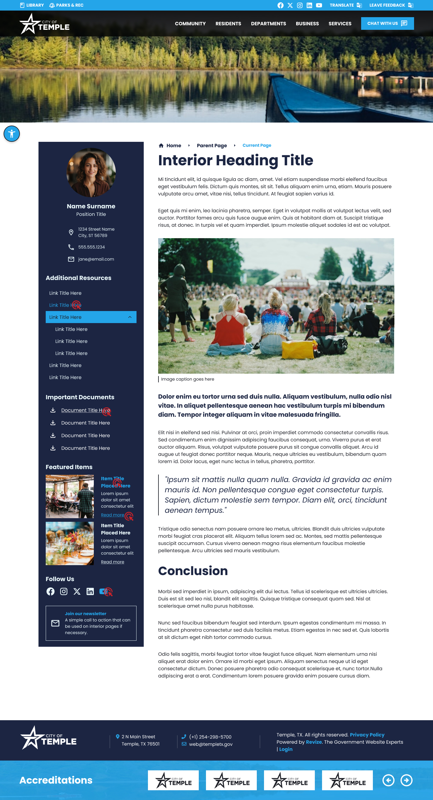
The initial design concept established the visual language — color, typography, layout hierarchy, and component patterns — that carried through all five revision cycles. Revisions refined rather than rebuilt: adjusting proportions, clarifying navigation structures, and fine-tuning the coordinated look across City Hall, Library, and Parks sub-sites.
Design Screens / Revision 5 (Final) / Desktop 1440px + Mobile 375px
Accessibility
ADA compliance across three sites
Three sub-sites means three separate accessibility audits. Every color combination, interactive element, and touch target was verified across City Hall, Library, and Parks & Rec before the final revision was delivered. Large cities have diverse populations — accessibility isn't optional.
Color contrast
All text and interactive elements audited at 4.5:1 minimum across all three site palettes. Sub-site color variations each verified independently — a coordinated system doesn't mean shared color passes.
Mobile touch targets
44x44px minimum touch targets enforced in the mobile designs — the 375px exports make this explicit. Navigation items, service cards, and footer links all sized for real-world thumb interaction.
ADA module
Persistent accessibility widget positioned consistently across all three sub-sites — contrast, text sizing, and screen reader support available from every page.
Emergency alerts
Alert banner module styled and positioned for all three sites — critical for a city this size. Toggle-enabled through the CMS so staff can activate without a developer.
Outcome
Five cycles to the final approval
The City of Temple approved the design after Revision 5. What started as a complex multi-site brief became a coordinated visual system — three distinct but cohesive experiences, a full mobile design package, and two tile template variants for the city's flexibility at launch.
The number of revision cycles isn't a failure metric — it's a collaboration metric. A client engaged enough to give five rounds of precise feedback cares deeply about the outcome. That engagement produces better work.