Revize · City website · Approved August 2026
Williams, Arizona
Williams is a small Route 66 town at 6,762 feet, the Gateway to the Grand Canyon, inside the largest Ponderosa pine forest in the world. The site had one unusual requirement: it must look nothing like the City of Williams, California.
The brief
Not the other Williams
The city's identity matters mostly because it separates Williams, Arizona from Williams, California. A wide illustrated lockup made for the web couldn't hold up at navigation size, so its wordmark goes in the nav and the official city logo goes in the footer.
The city also wants its website, not Facebook, to be the source of truth. That drove several decisions: a Watch Live card that lands on a page of the site instead of YouTube, public notices in place of a news feed nobody would keep fresh, and no mayor's message, because mayors turn over every two years.
The approach
Mile Marker 6762
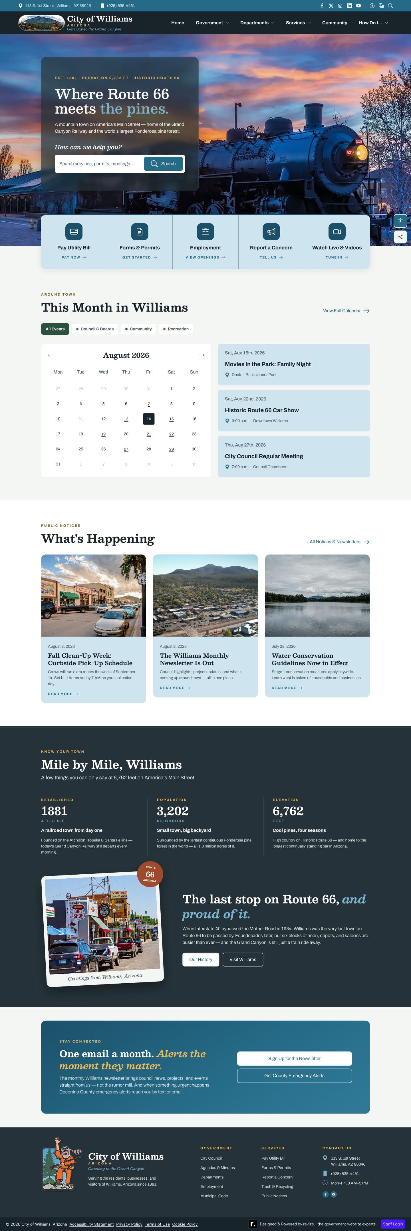
I explored three divergent art directions and chose national-park-poster Americana built only from what Williams has: the last bypassed stretch of Route 66 and a pine forest at 6,762 feet. Then I cut the decoration back over several review rounds, removing shields, dashed centerlines, and sawtooth ridgelines, until the photography and the copy carried the idea.
Palette · contrast measured against white
- Alpine Lake#256B875.95:1 on white · AAPrimary
- Ponderosa Pine#28513F8.98:1 on white · AAASecondary
- Mountain Slate#25323913.17:1 on white · AAA
- Aspen Gold#D8A63F2.22:1 on white · accentMotif only
- Gold Ink#7C5E166.05:1 on white · AAGold as text
- Alpine Mist#F3F6F2Surface
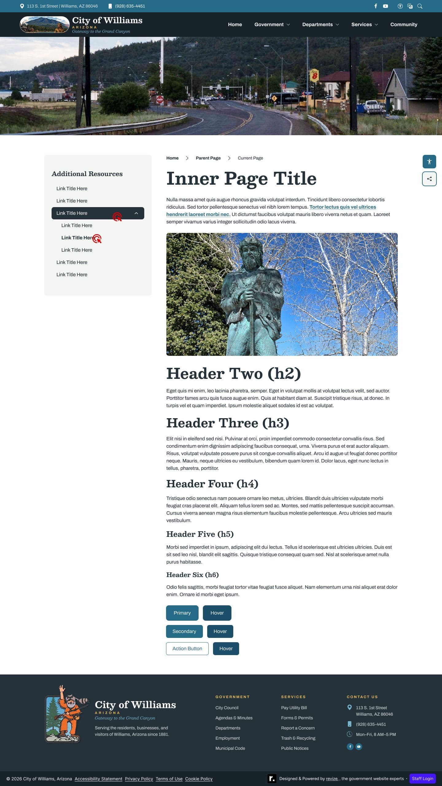
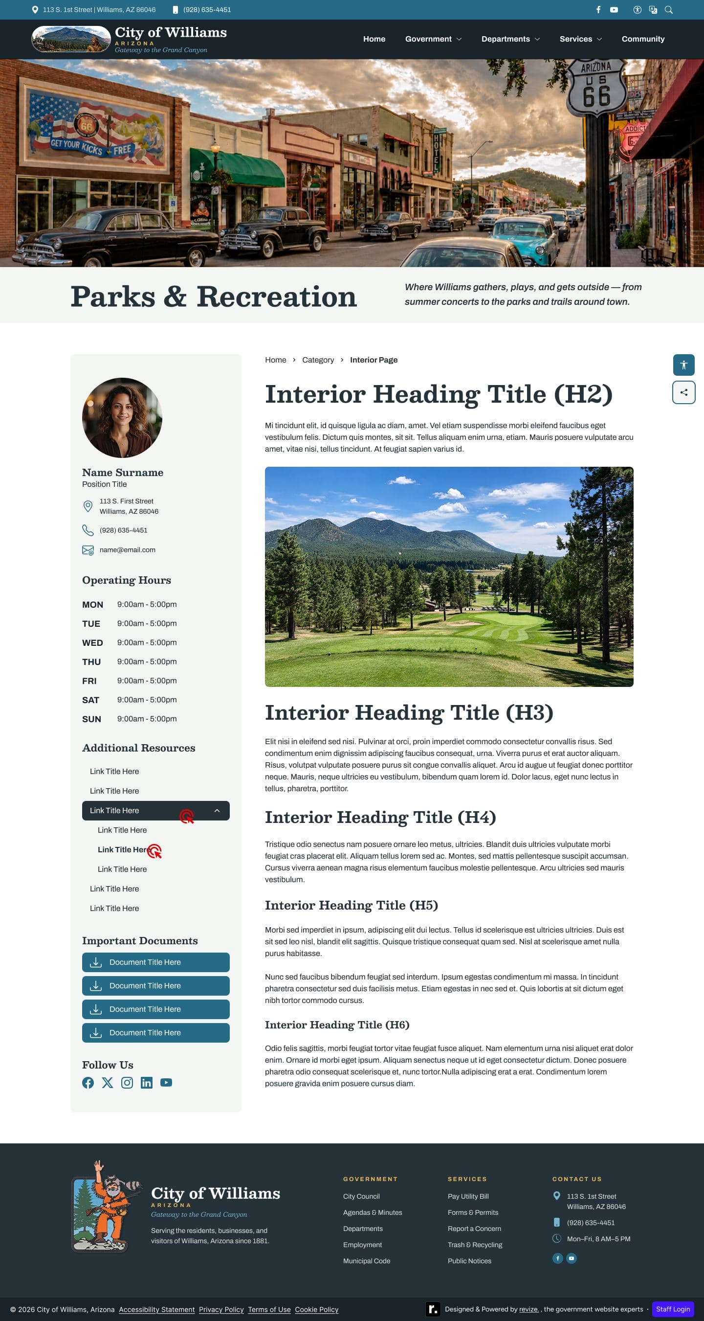
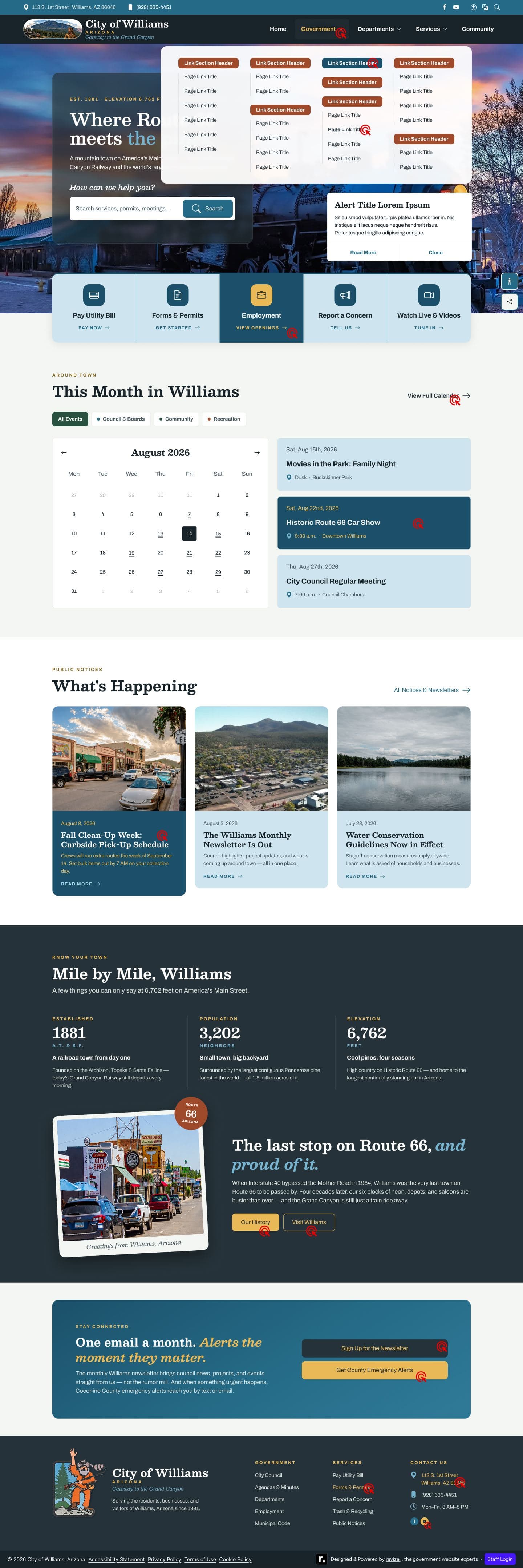
The rest of the approved set · desktop, 1440px
Outcome
Fewer motifs, more Williams
The direction went through a series of internal review rounds that each took something away, then went to the city and was approved after a single revision round. It was built natively on the company design system, so every component it added is reusable.