Revize · Town website · Approved August 2026
Haw River, North Carolina
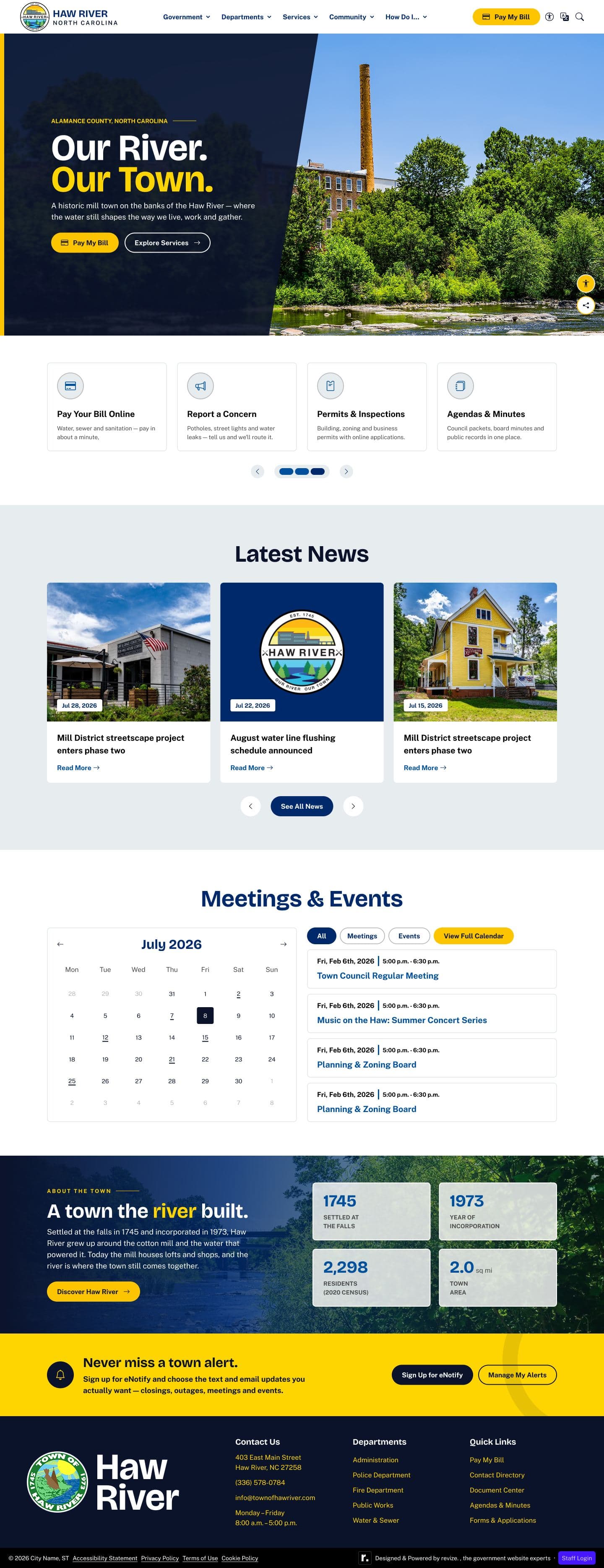
Haw River is a small Piedmont town built around a historic textile mill, with the motto “Our River. Our Town.” The direction from kickoff was simplicity: a solid hero panel, bill pay up front, and nothing busy.
The brief
Keep it simple, put bill pay up front
The town was replacing a dated site and gave the designer free rein on color. Its 2019 tree logo with the “Our River. Our Town.” tagline goes in the navigation, and the roughly fifty-year-old official seal goes in the footer.
I ran the kickoff from a deck built for the meeting, and the decisions came straight out of it: one navigation bar with no utility bar, no social media anywhere because the town doesn't use it, and online bill pay as the most prominent action on the page.
The approach
When the color belongs to the neighbors
The first concept used a deep green and gold drawn from the logo. The town turned the green down twice, and the deciding reason wasn't the shade: neighboring Green Level uses a similar green. So I retired it entirely and blended a blue system from three palettes the client picked, giving each palette one job.
Palette · contrast measured against white
- River Blue#00509D7.97:1 on white · AAAPrimary
- Midnight#00296B13.73:1 on white · AAAHero panel
- Deep Navy#0B132B18.38:1 on white · AAAFooter
- Gold#FDC5001.60:1 on white · accentFills and dark surfaces only
- Gold Ink#8A5A005.93:1 on white · AAGold as text
- Serene#E7ECEFSurfaceLight bands
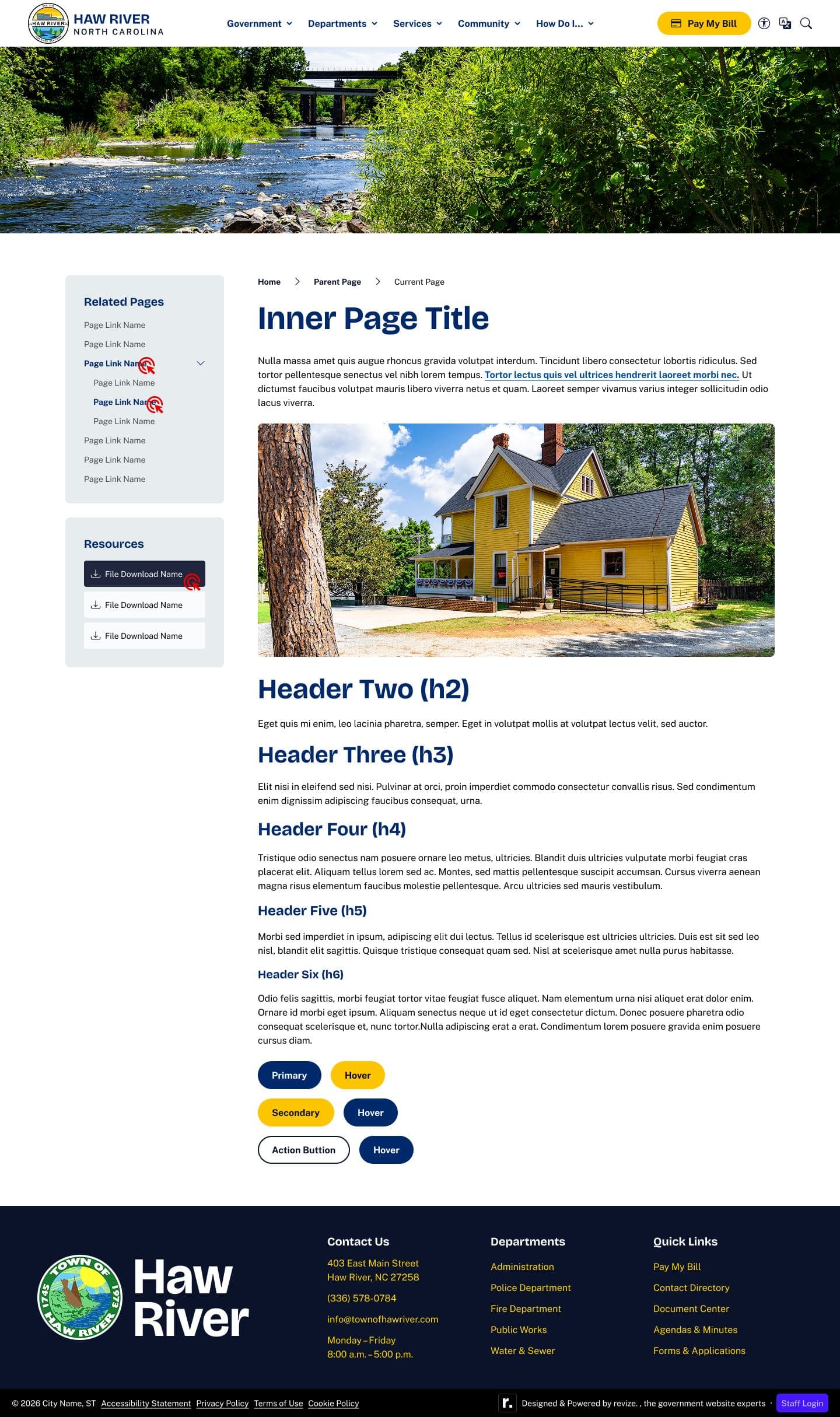
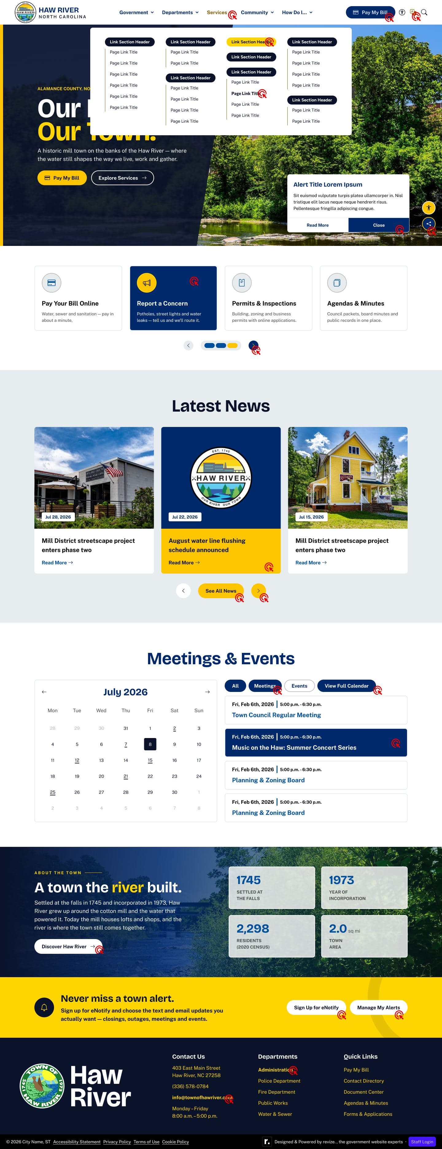
The rest of the approved set · desktop, 1440px
Outcome
A full retheme without a rebuild
Because the design was bound to variables, the switch from green to blue propagated through every board. An audit still found 18 elements hardcoded to the old green, and all of them were rebound before the client saw the revision.